How to Make a Responsive Table WordPress?
Creating a user-friendly website means knowing how to make a responsive table in WordPress so your data stays readable on desktop, tablet, and mobile alike.
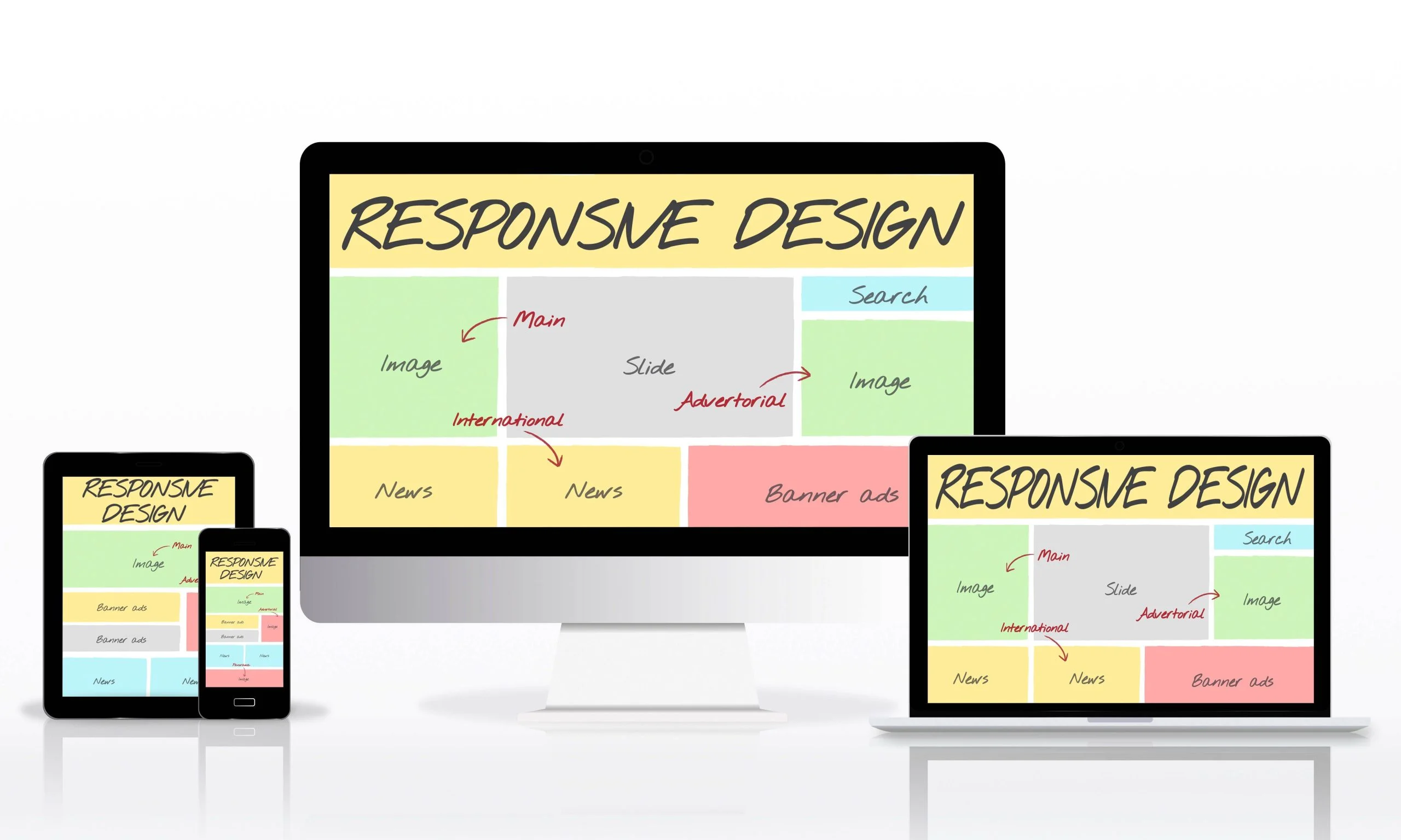
Creating a user-friendly website is essential for engaging visitors and providing valuable information. One important aspect of enhancing user experience is knowing how to make a responsive table in WordPress. Responsive tables are vital as they allow your data to be easily readable on any device, whether it’s a desktop, tablet, or smartphone. Here’s how to build one, plus a few tips to make your tables more effective.

What Are Responsive Tables?
Responsive tables automatically adjust their layout based on the size of the screen. This feature is crucial for improving user experience (UX) and ensuring that your content is accessible to all users. By learning how to make a responsive table in WordPress, you can provide your audience with a more enjoyable browsing experience.
Why Are Responsive Tables Important?
- User Engagement: When users find it easy to read and navigate your tables, they are more likely to remain on your site longer, which can lead to increased conversions.
- SEO Benefits: Search engines like Google reward sites that prioritize user experience, which can help improve your rankings.
- Professional Look: Well-structured and responsive tables contribute to a polished, professional appearance for your website, enhancing credibility.
How to Create a Responsive Table in WordPress
Step 1: Choose the Right Plugin
The easiest way to create responsive tables in WordPress is by using a plugin. Several options are available, each with unique features:
- TablePress: A user-friendly and popular free plugin that allows you to create, manage, and display tables effortlessly. You can also import tables from Excel or CSV files.
- WP Table Builder: A drag-and-drop table builder that simplifies the process of creating responsive tables quickly and efficiently.
- Ninja Tables: This plugin offers advanced features such as sorting, filtering, and customization options, making it an excellent choice for more complex tables.
Step 2: Installing Your Chosen Plugin
To install a plugin in WordPress, follow these steps:
- Log into your WordPress dashboard.
- Navigate to Plugins > Add New.
- In the search bar, type in the name of your chosen plugin (e.g., “TablePress”).
- Click on Install Now, and after the installation, click Activate.
Step 3: Create Your Table
Once your plugin is active, you can begin creating your table. For example, if you’re using TablePress, here’s how to create a new table:
- Go to TablePress on your dashboard.
- Click on Add New Table.
- Specify the number of rows and columns you want and click Add Table.
- You’ll be taken to a screen where you can input your data.
Step 4: Ensure Your Table is Responsive
After creating your table, it’s essential to make sure it’s responsive. Many modern table plugins automatically apply responsive design principles, but it’s always good to double-check:
- For TablePress, navigate to Plugin Options and enable the responsive mode.
- If using Ninja Tables, you can customize the responsive options in the plugin settings.
Step 5: Inserting the Table into a Post or Page
Once your table is ready, you need to insert it into a post or page. Here’s how to do it:
- Copy the shortcode provided by the plugin.
- Go to the post or page where you want to display your table.
- Paste the shortcode into the content area.
- Publish or update the post/page to view your table.
Step 6: Testing Responsiveness
After your table is live, check how it appears on various devices. You can do this by resizing your browser window or using a mobile device to access your site. Ensure that your table adapts well without losing readability or functionality.
Tips for Making Your Tables More Effective
- Limit Data: While tables are fantastic for presenting information, presenting too much can overwhelm users. Focus on key information to keep it concise.
- Use Descriptive Headings: Clear headings help users quickly understand the data presented, improving the overall user experience.
- Design and Color: Use contrasting colors to differentiate headers from the data for better readability.
- Regular Updates: Ensure your tables remain current and relevant. Outdated information can mislead users and affect your site’s credibility.
Enhancing Your Tables for Better Performance
Creating a responsive table is just the beginning. Here are additional strategies to enhance your table’s performance:
- Optimize Loading Speed: Ensure your tables load quickly by optimizing images and reducing the amount of data displayed.
- Mobile Optimization: Test your tables on different mobile devices to ensure a seamless experience for all users.
- Interactive Features: Consider adding features like sorting and filtering to make your tables more interactive and engaging for users.
Real-World Examples
To better illustrate the effectiveness of responsive tables, let’s look at a few examples:
- Restaurant Menus: Many restaurant websites use responsive tables to display their menus. This makes it easy for customers to view available dishes and prices on any device.
- Product Listings: E-commerce sites often employ responsive tables to showcase product features, prices, and comparisons, helping customers make informed decisions.
- Data Reports: Companies frequently use tables to present data reports, making it easier for stakeholders to understand the information at a glance.
Wrapping Up
Understanding how to make a responsive table in WordPress is a small but genuinely useful skill, it improves usability and gives your site a more professional feel across every device. Follow the steps above, keep the tips on data and formatting in mind, and your tables will hold up whether someone’s viewing on a desktop or a phone.
Interesting Reads:
How to Import WordPress XML into Contentful
Plugins we build and run
We maintain these ourselves, which is why we can support them on your site.
- BuddyNextThe self-hosted community engine for WordPress
- BuddyXFree community theme, Pro when you outgrow it
- ReignPremium community theme. Add pieces, build anything
- JetonomyCommunity forum and Q&A for WordPress
- EventonomyEvents and RSVPs for WordPress communities
- LearnomyCourses and learning communities on WordPress
- ListoraDirectories and listings your members can browse
- SnipShareCode sharing built for developer communities
- WB Ad ManagerAd placements that turn traffic into revenue
- WP Career BoardA job board your community actually uses
- WP Sell ServicesSell services with offers, orders, and payouts
- MediaVersePhotos, video, and media albums for members
- WB GamificationPoints, badges, and rewards that keep members active
- Product RoadmapPublic roadmaps with voting your users trust